
Good typography makes a page easy to read before anyone notices the design. Typography in InDesign gives you precise control over every part of the text. These are the six rules to start with.
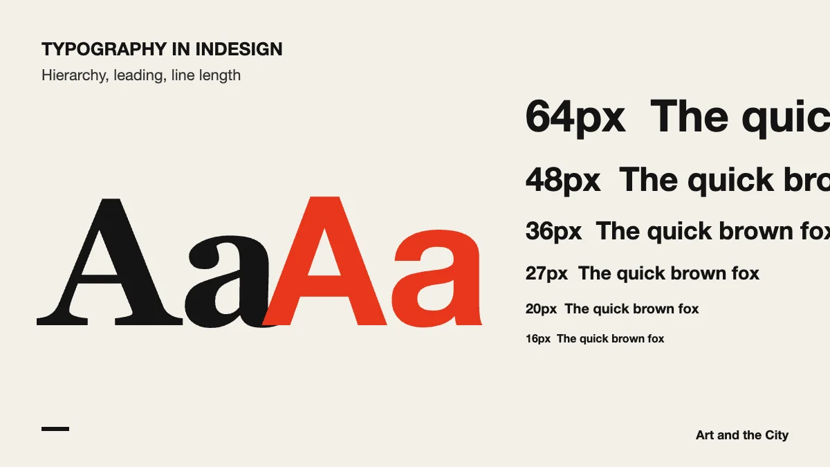
Readers should see at once what to read first. Therefore, use a clear difference in size and weight between the headline, subheads and body text.
Two fonts are usually enough. Use one for headings and one for body text, or one family with several weights.
Body text needs enough line spacing to breathe. If lines feel tight, increase the leading a little, and look at a printed proof if you can.
Very long lines tire the eye, while very short lines break the rhythm. Aim for a comfortable line of roughly 45 to 75 characters in body text.
Styles store your choices. When you change a style, every paragraph with that style changes with it. As a result, long documents stay consistent.
Look for single words on a last line, awkward line breaks and uneven spacing. Small fixes like these make a page look finished.
For more on choosing and pairing typefaces, the Google Fonts Knowledge library has clear, free lessons. Typography is part of every module in our online graphic design course, and InDesign is where you apply it to full pages.
