
A flyer is a good first InDesign project. It is small, it has one message and you can print it. Follow these six steps to design a flyer in InDesign that looks calm, clear and professional.
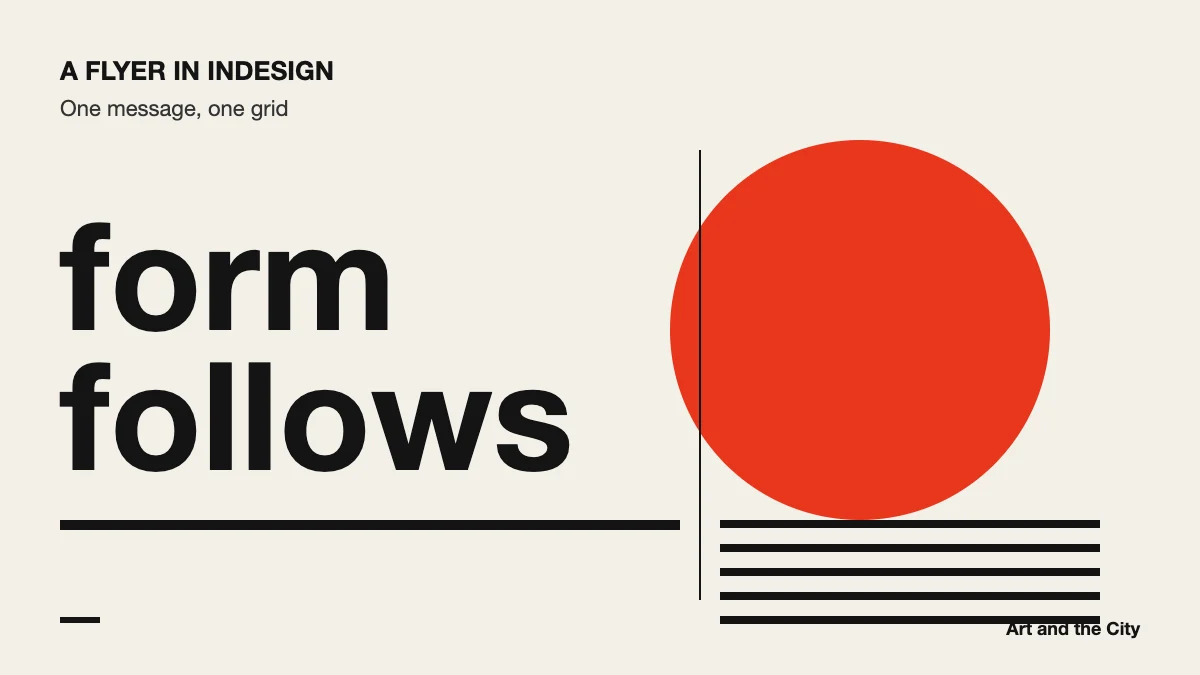
Choose the format, for example A5, and add bleed. Bleed is extra image area outside the page edge that gets cut off. Since every printer works a little differently, ask yours which bleed they need.
Set margins and two or three columns. A simple grid keeps your text and image aligned, so the flyer feels organized at first glance.
Place one strong image and let it carry the flyer. Make it large and give it room. In other words, don’t add four small photos when one good one says it all.
Write a headline, a short body text and the practical details. Give each level its own paragraph style, with a clear difference in size and weight.
Use a limited palette of two or three colors. Then place the date, place and contact details where people can find them at once, usually at the bottom.
Export one PDF with bleed and crop marks for the printer. After that, export a second, smaller PDF for sharing on screen. Adobe describes the print settings in detail in the InDesign user guide.
Print the flyer at home first and hold it at arm’s length. Can you read the headline in two seconds? Is the date easy to find? If not, make the headline bigger and remove one element. Usually the flyer gets better when you take something away.
You learn InDesign with live lessons and feedback in our online graphic design course.
